further concept presentation
section architects
brand refresh
a refinement of the section architects visual system: colour, logotype, and digital behaviour, keeping the work and content at the foreground.
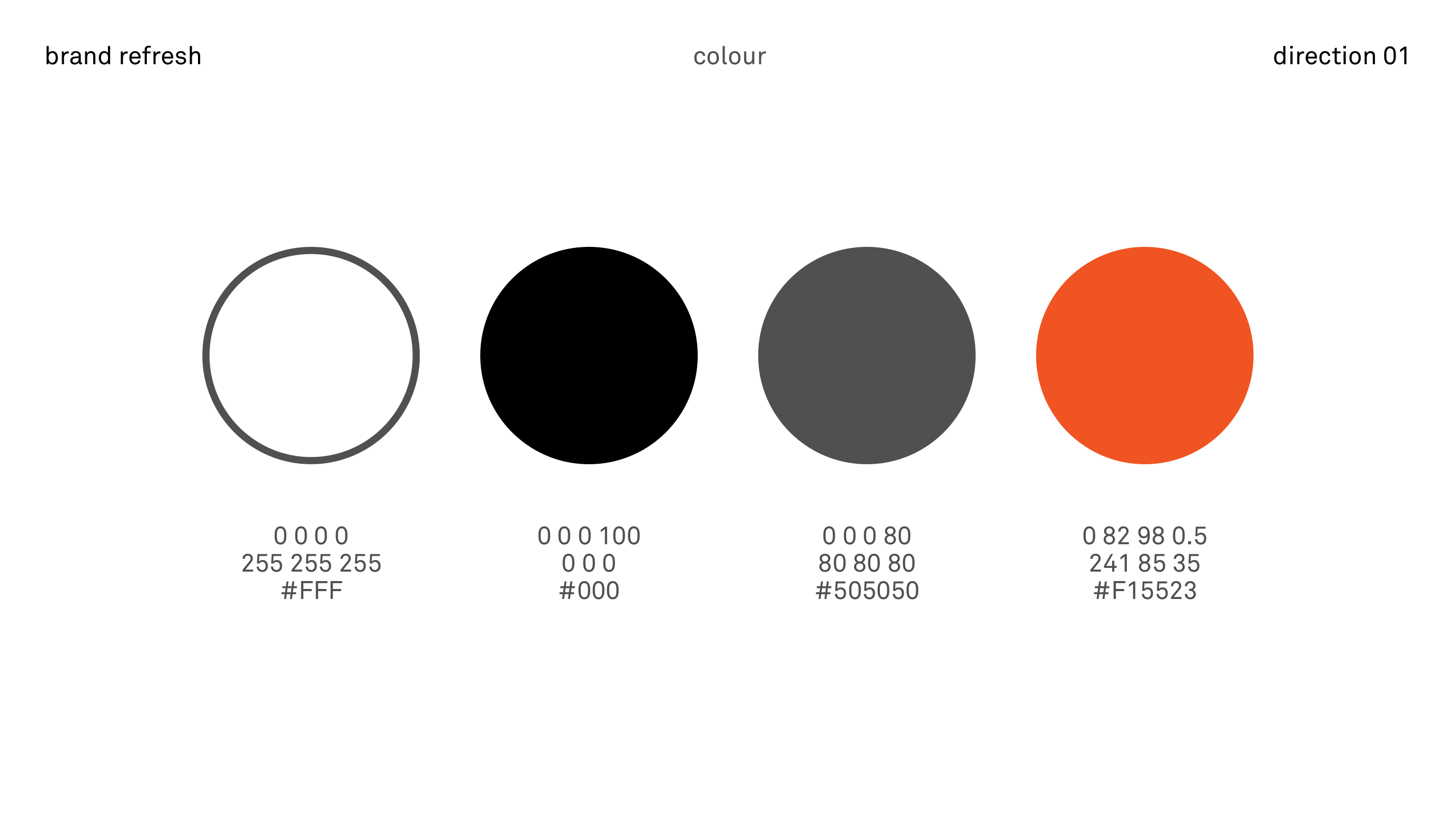
direction 01 · colour
the palette is deliberately reduced, centred on a black–white axis with a single high-energy accent. it supports strong typographic hierarchy without competing with project imagery.
neutral greys carry most ui elements; the accent is reserved for states, calls to action, and key markers in the digital system.
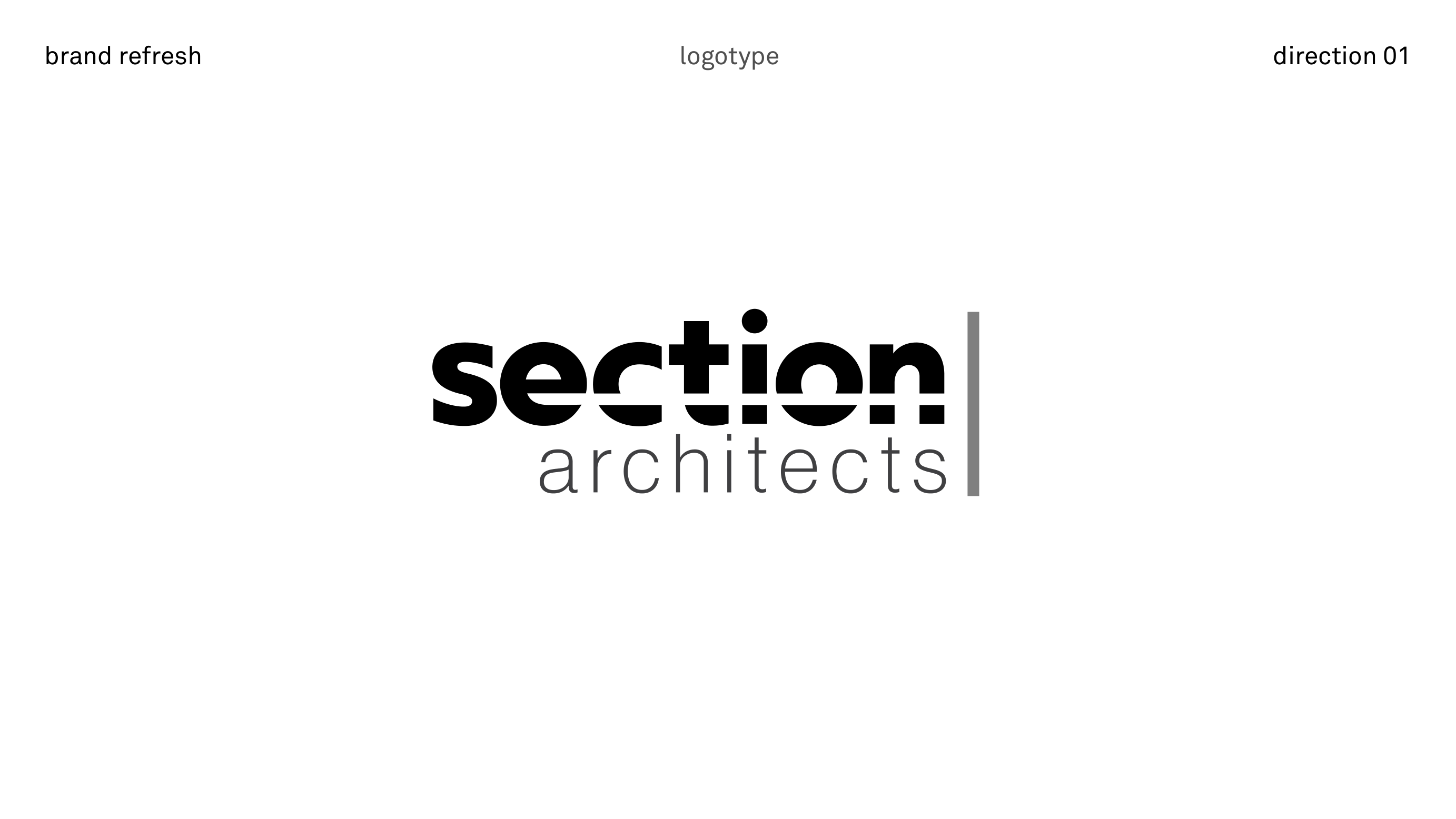
logotype · direction 01
a wordmark that keeps the character of the existing identity while introducing a clearer set of optical rules and size-based behaviours.
scale and optical adjustment
the logotype responds to scale. at larger widths it is set without correction; as it scales down, stroke adjustments preserve legibility and balance.
- > 4 in width · no optical adjustment
- > 3 in width · no optical adjustment
- > 2 in width · 0.5 pt stroke added for optical correction
- < 1.5 in width · 0.5 pt stroke maintained
- < 1 in width · transition to “sa” iconography
the relationship between “section” and “architects” is governed by a proportional system that sets the lower word within the structural bar while keeping a clear first read.
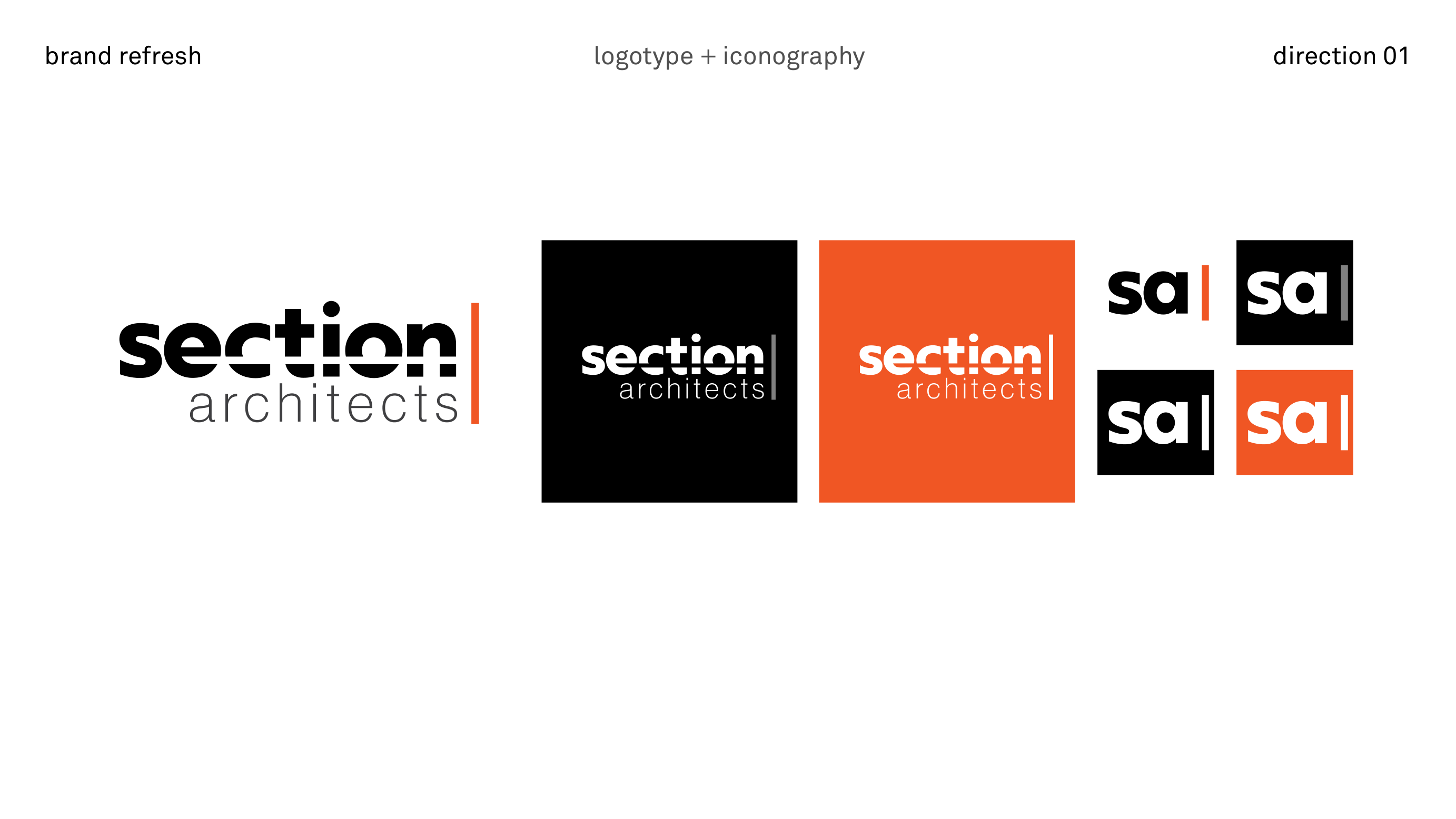
logotype + iconography
the system introduces a compact “sa” symbol for very small applications, favicons, and constrained ui spaces. it shares the same grid and stroke logic as the full wordmark.
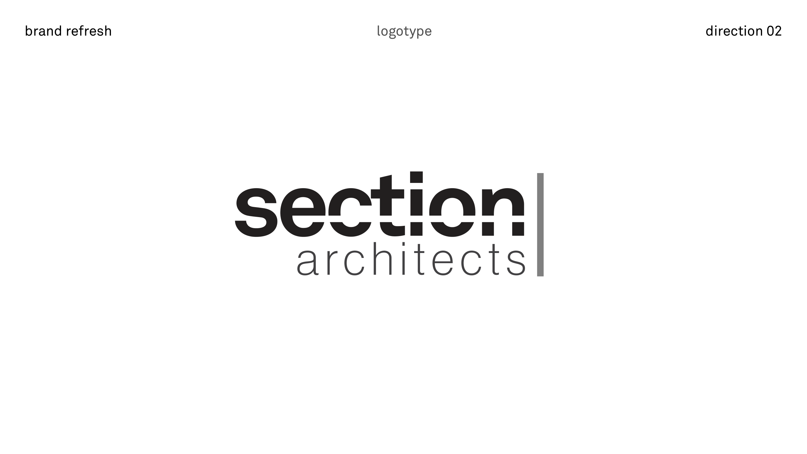
logotype · direction 02
a second option that emphasises the structural bar, aligning the lower word more tightly with the horizontal band.
bar alignment
in this direction, “architects” is mathematically aligned to the bar, then optically tuned to keep the mark balanced. the same size rules apply as in direction 01, including the progression to the “sa” symbol at very small scales.
website · expanded
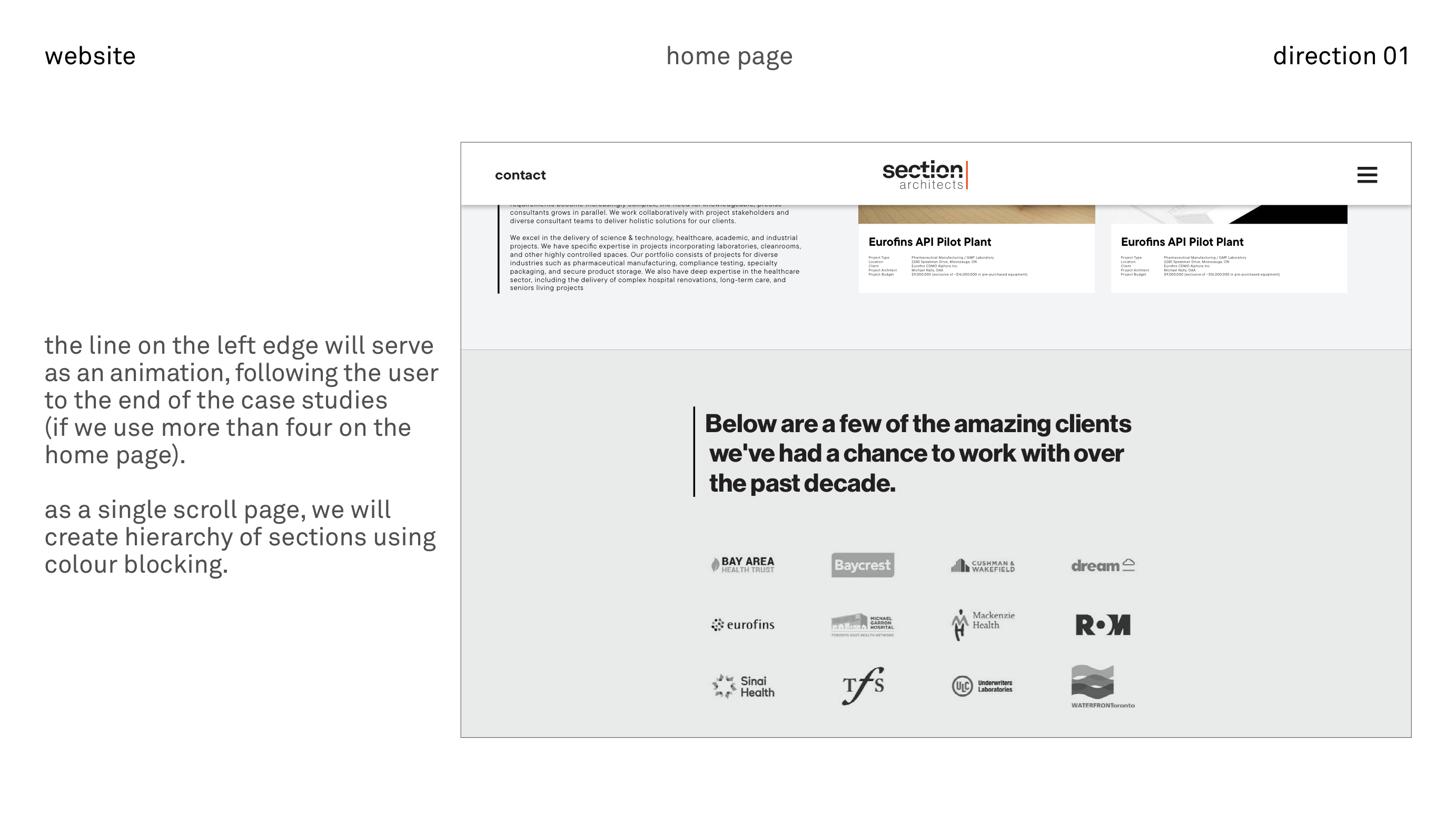
the digital system extends the refreshed identity into a single-scroll experience that foregrounds case studies, supported by clear navigation and motion cues.
landing page · direction 01
a focused first screen that appears on initial visit only. a single down arrow introduces the page’s vertical scroll language and echoes the section-cut concept.
home page · direction 01
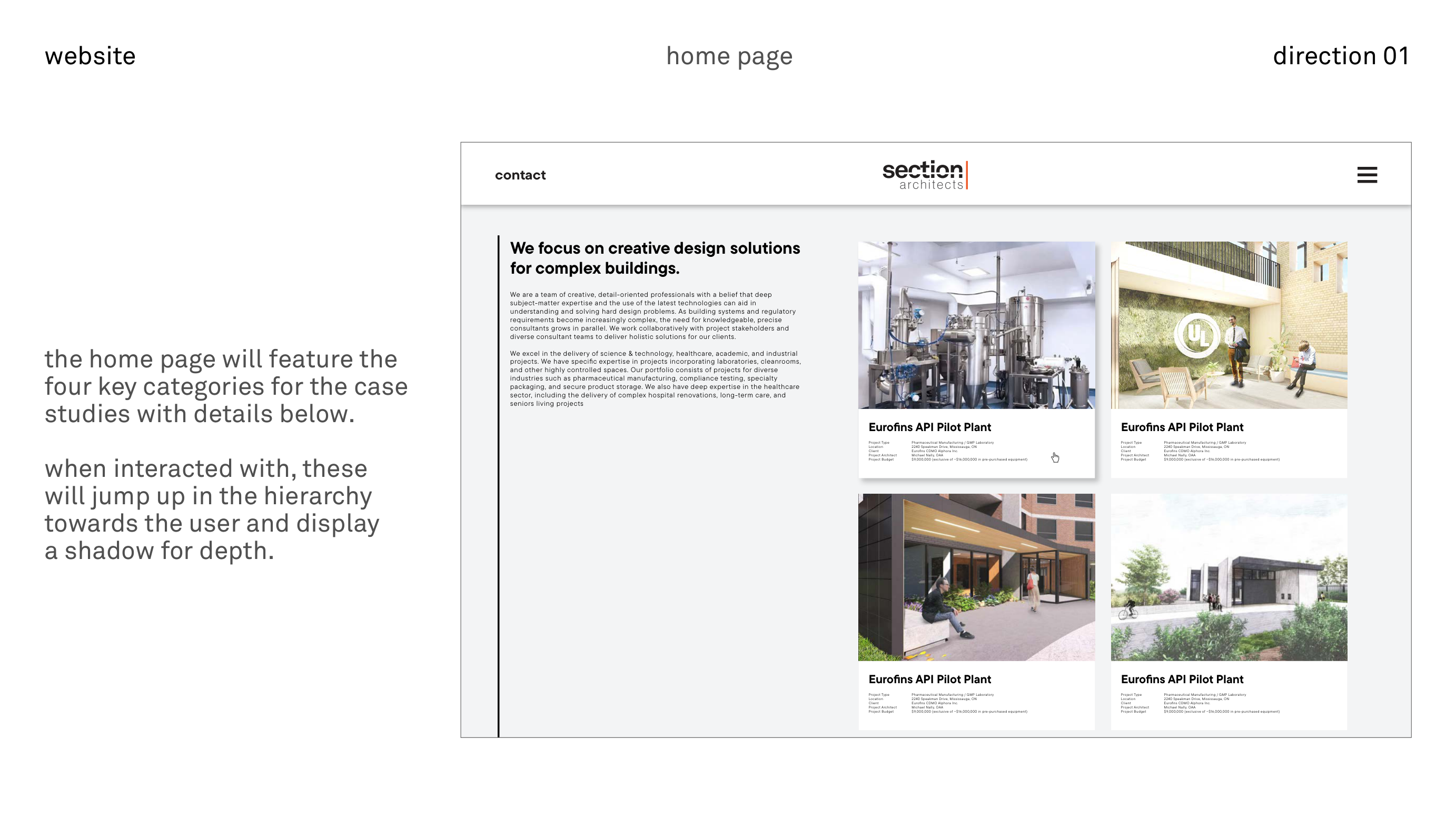
the home page introduces four primary case-study tiles, each combining image, project facts, and short narrative. motion is subtle: hover states lift tiles slightly and add shadow for emphasis.
case studies and menus
interior case-study templates and navigation overlays extend the visual system into deeper content.
case studies · inner page
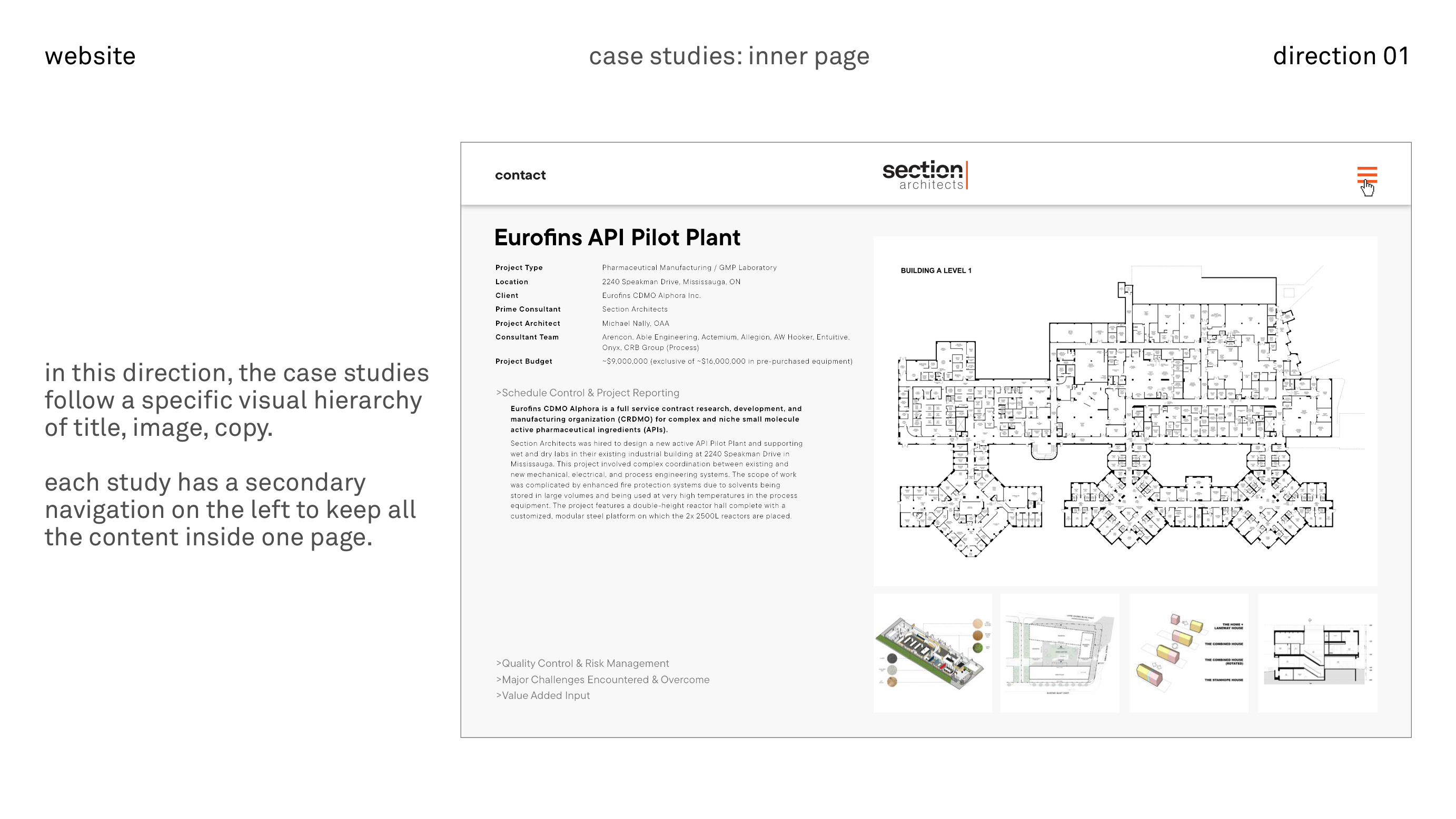
pages like the eurofins api pilot plant template use a clear hierarchy: title and project facts beside a hero image, followed by anchored sections for schedule, risk, challenges, and value-added input.
menus and overlays
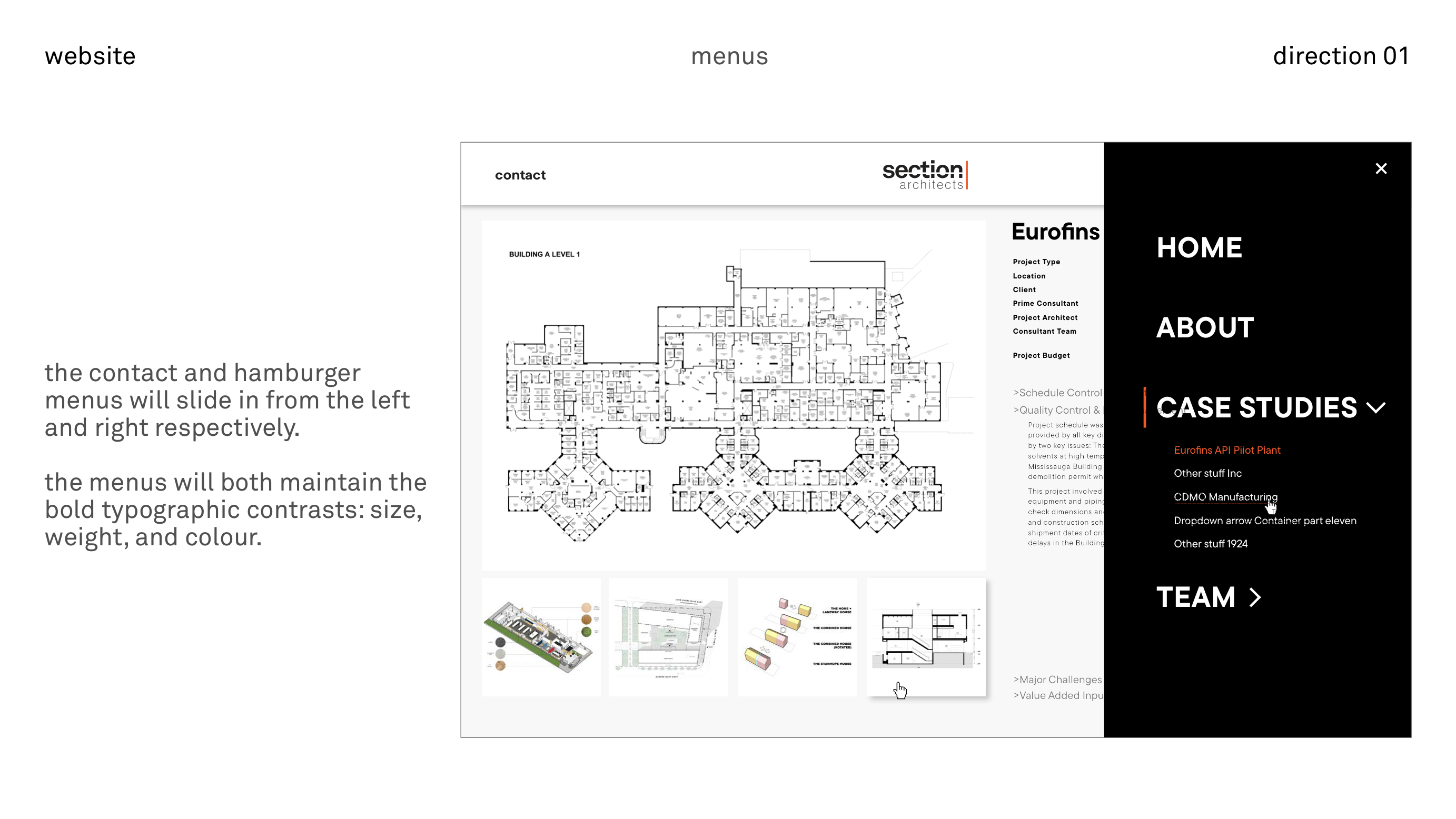
contact and navigation are handled through sliding panels that preserve the bold typographic contrast of the identity, with case-study groups exposed as sub-items under a single “case studies” heading.
case studies · direction 02
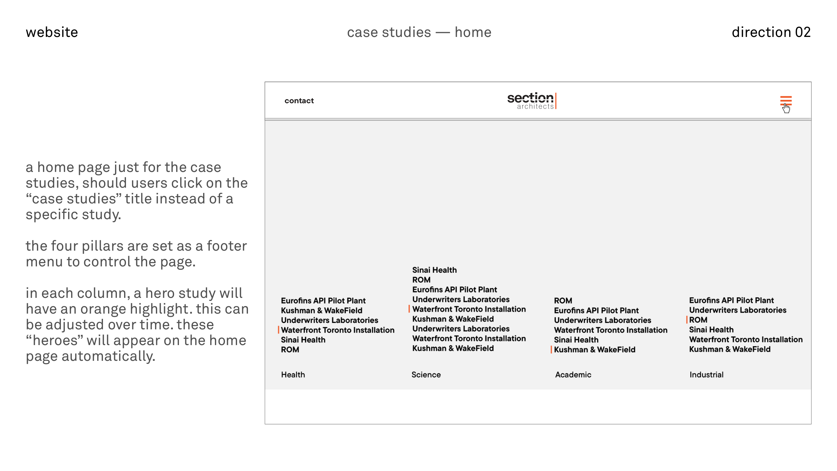
an alternate case-studies home and inner-page treatment, using a four-column sector layout and a carousel-led detail page.
case studies home
projects are organised under health, science, academic, and industrial pillars, with a footer-style control for moving between columns and hero projects feeding the main home-page tiles.
inner page · image-first
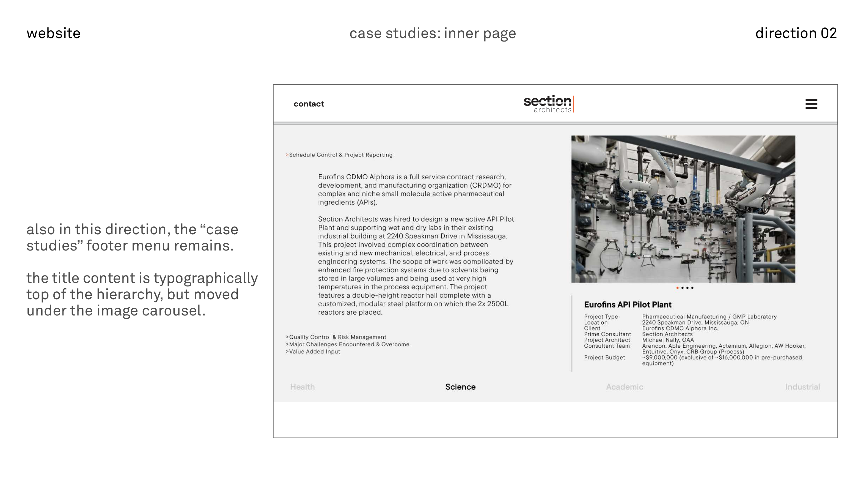
a large image carousel introduces the project, followed by title, detail column, and extended copy. the sector footer remains in view, allowing lateral navigation across pillars.
thank you!
this page collects the brand, logotype, and website directions from the original deck into a single, responsive scroll, preserving the original graphics alongside the supporting copy.