brand systems + visual identity
visual identity
identity systems · event brands · guidelines
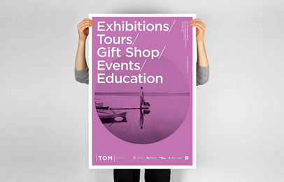
TOM — retail identity system
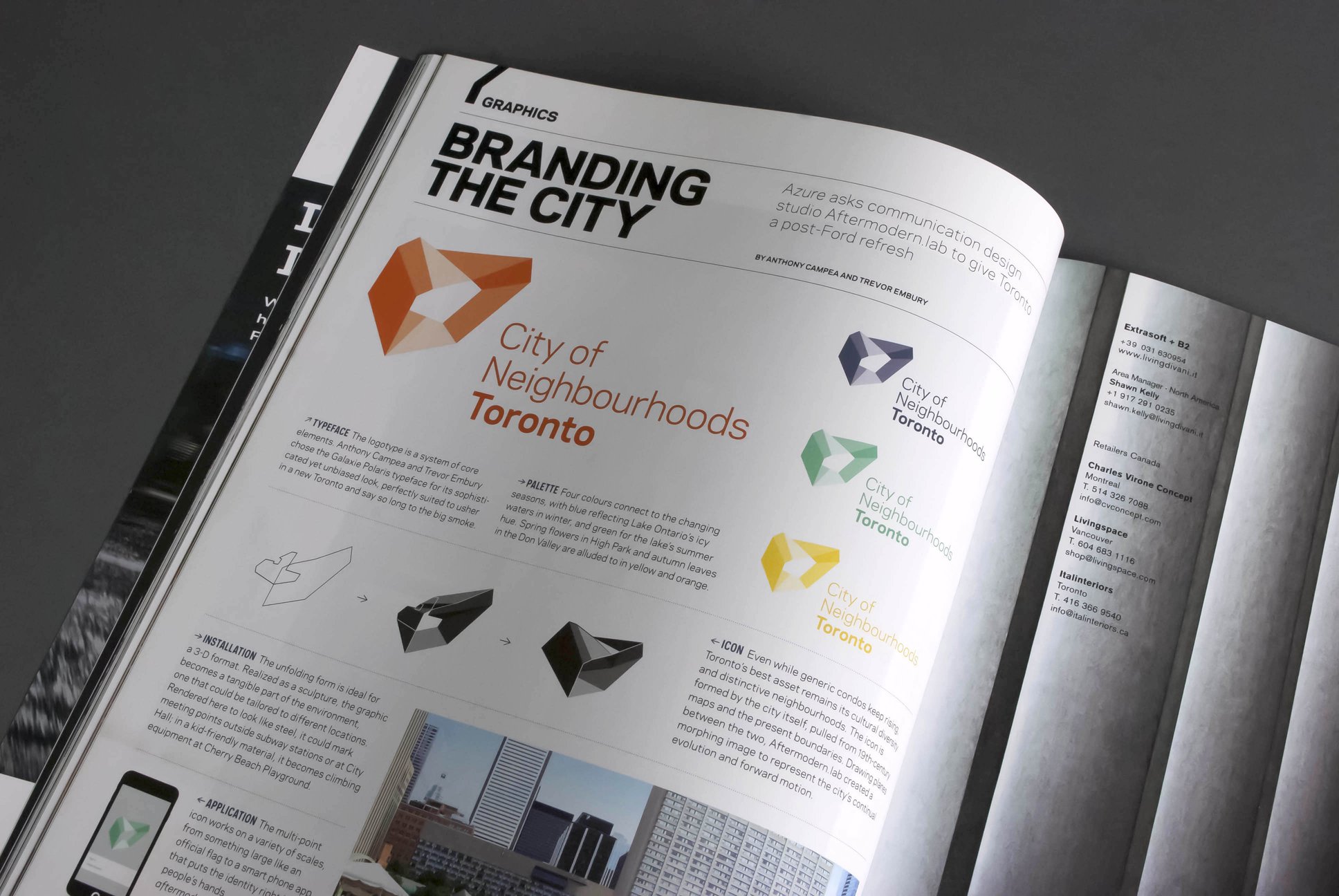
TOM is a retail-facing identity built around bold typographic compositions, structured grids, and a flexible colour system. Guidelines translate the core marks into posters, in-store graphics, and digital touchpoints without losing the edge of the original concept work.
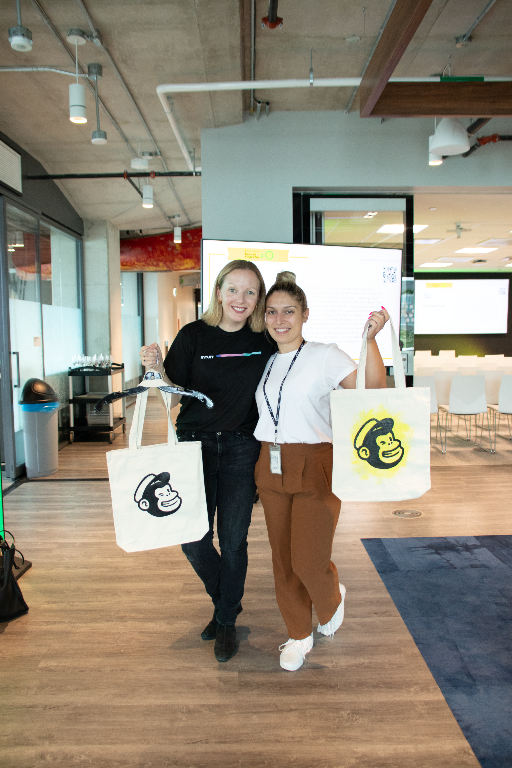
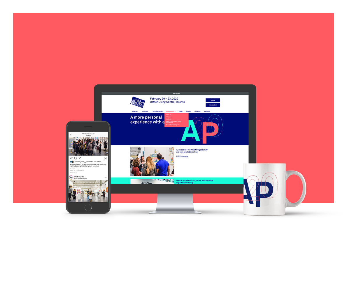
intuit day + AP20 — event identities
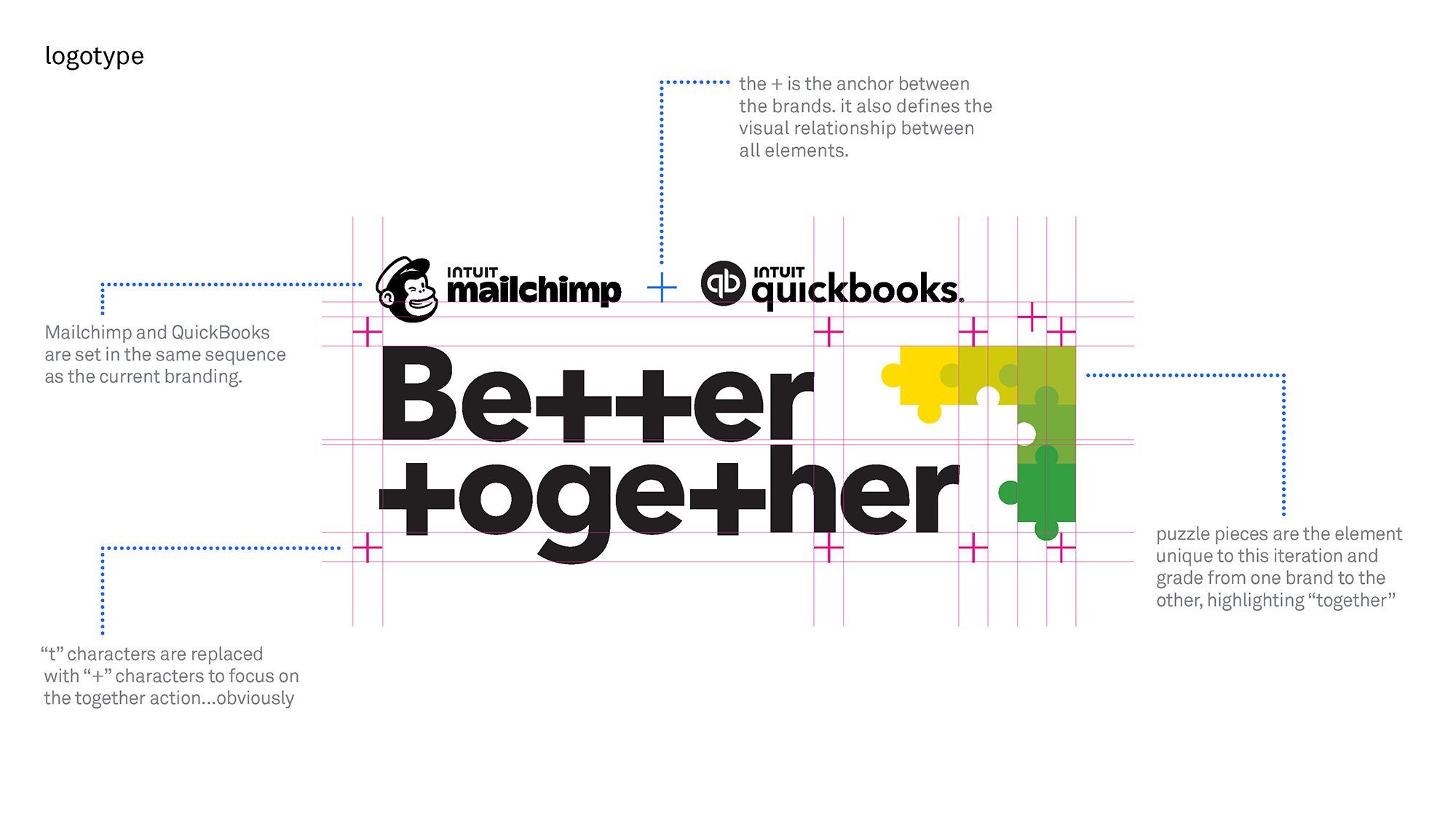
For time-based events, the studio designs identities that scale from a single mark to full campaigns. Systems for Intuit Day and AP20 balance strong typographic voice with photography, iconography, and motion-friendly layouts.
Currated Type and Image
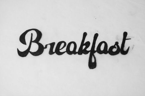
Visual identities that focuses on clear typography and modular UI-friendly components. Collaborn: The mark, supporting shapes, and colour palette are designed to sit comfortably in dashboards, marketing sites, and product surfaces without adding friction. Breakfast Before: custom illustration and typographic treatments combine to create a warm, approachable brand for a personal-care brand with deep roots in Montréal, Canada.

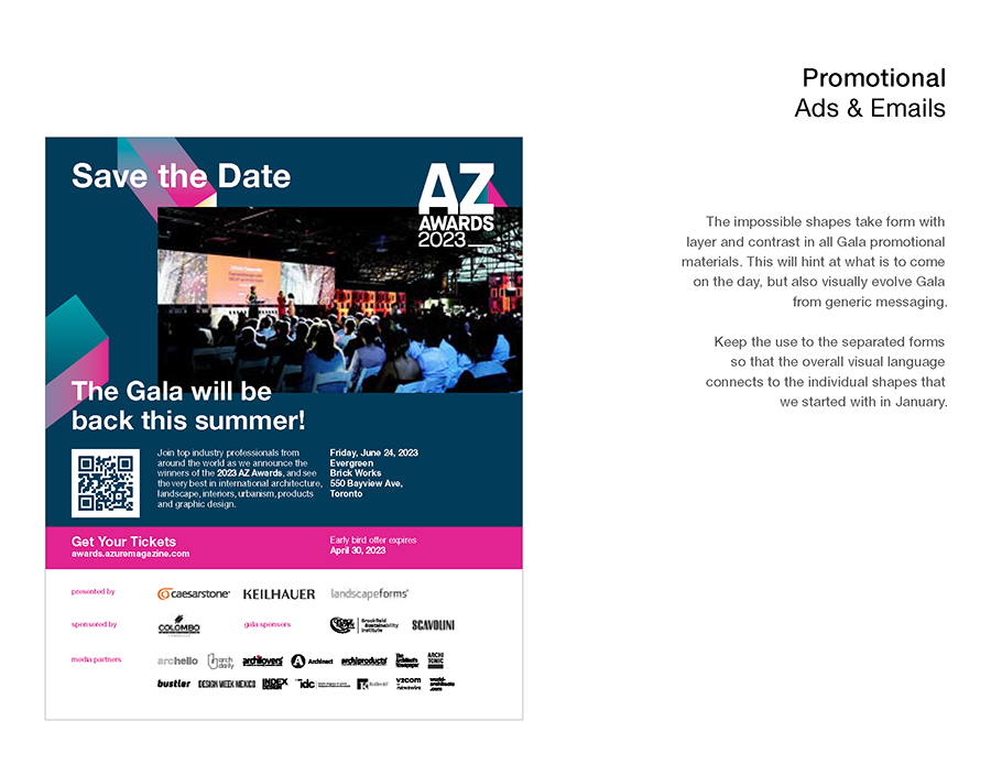
shapes + umbrella systems
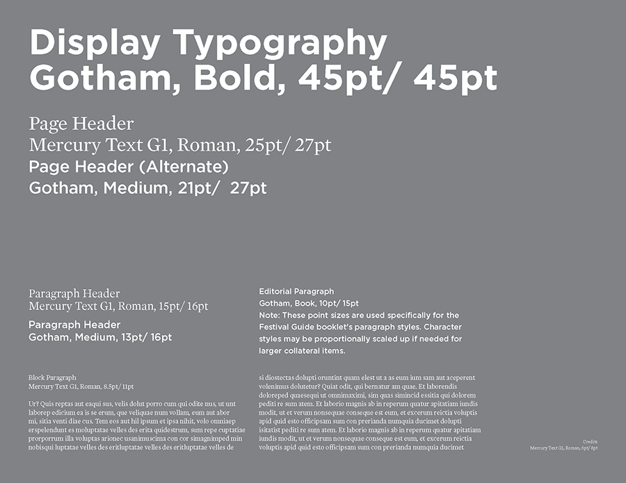
For larger-scale clients and award programs, the studio builds identities as sets of rules rather than one-off posters. Shape systems, typographic hierarchies, and production notes are captured in guidelines that can be used by in-house teams, printers, and collaborators over time.

